Meal-kraft

Positioned Meal-Kraft as a reliable cafeteria solution provider through branding, social media, and enterprise-ready platforms.

Overview

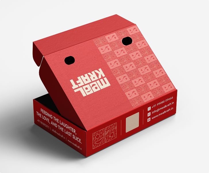
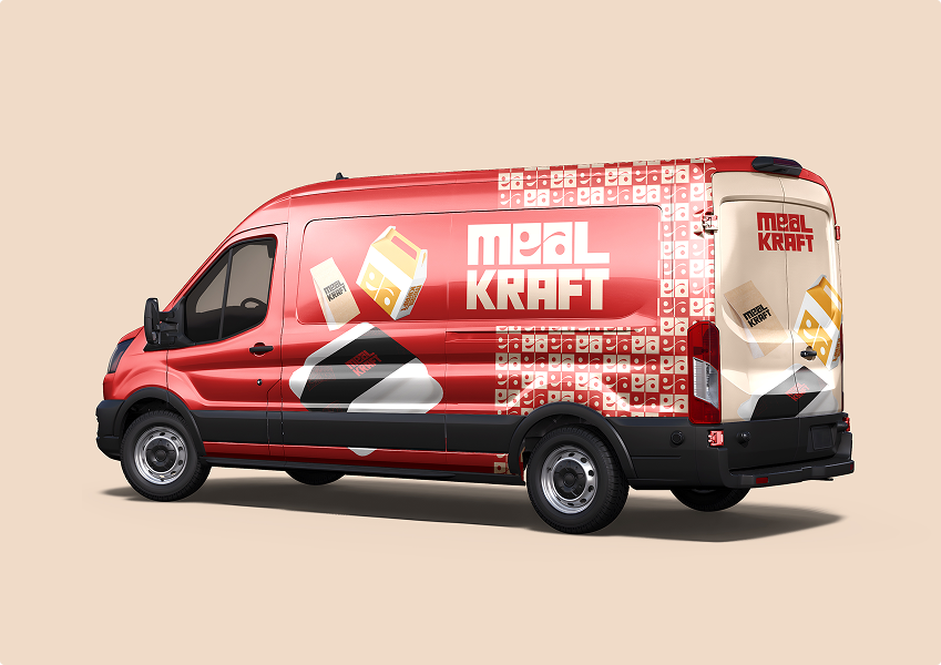
Meal-Kraft is a smart food-tech brand helping organizations manage cafeterias with ease. From daily food delivery to a smooth ordering app and catering, it makes food management simple, reliable, and stress-free. The website, apps, and dashboards promote convenience, reduce queues, and improve food experiences.

THE TASK

The task was to create a strong, unified brand identity for
Meal-Kraft, covering logo, social media, website, and apps, while ensuring consistency, clarity, and appeal across diverse digital touchpoints.

LOGO

The Meal Kraft logo combines bold, geometric typography with symbolic details to reflect strength, efficiency, and modernity. The use of spoons in the letters ties the identity to food, emphasizing care, precision, and nourishment while positioning the brand as a reliable B2B meal provider.

LOGO

The Meal Kraft logo combines bold, geometric typography with symbolic details to reflect strength, efficiency, and modernity. The use of spoons in the letters ties the identity to food, emphasizing care, precision, and nourishment while positioning the brand as a reliable B2B meal provider.

VISUAL LANGUAGE

The visual language extends Meal Kraft’s identity with bold colors, clean layouts, and consistent design elements that highlight efficiency, reliability, and warmth. It reinforces the brand’s professional yet approachable presence across platforms.

Primary Font

Franie Test

ABCDEFGHIJKLMNOPQRSTUVWXYZ

abcdefghijklmnopqrstuvwxyz

Secondary Font

Arimo

ABCDEFGHIJKLMNOPQRSTUVWXYZ

abcdefghijklmnopqrstuvwxyz

COLORS USED for the brand.

VISUAL IDENTITY

The visual identity system for Meal Kraft unifies logo, colors, and typography into a cohesive brand presence. It reflects professionalism, culinary focus, and trust, while staying adaptable across digital and print.

VISUAL IDENTITY

The visual identity system for Meal Kraft unifies logo, colors, and typography into a cohesive brand presence. It reflects professionalism, culinary focus, and trust, while staying adaptable across digital and print.

THE RESULT

The branding positioned Meal Kraft as a trusted and modern B2B food solutions partner. A strong visual identity with a bold logo, cohesive visual language, and digital presence created consistency across platforms. This reinforced customer trust, improved brand recall, and established Meal Kraft’s credibility in the competitive food service industry.

Related Projects

Crafted a farmer-focused dairy brand identity rooted in Telugu tradition, purity, and nutrition.

Brand identity

Visual strategy

Marketing content

Built a fresh and sustainable identity for Kine Milk to bring farm-to-home dairy closer to modern families.

Brand design

Visual strategy

Marketing content

Launched a hyper-local brand identity rooted in East Godavari culture, cuisine, and coastal storytelling.

Brand refinement

Marketing content

Visual strategy

Ready to build a brand that actually moves?

Punnaiah Plaza Building, 2nd Floor, Road No. 2, Park View Enclave, Jubilee Hills, Hyderabad, Telangana 500045

Subscribe to our newsletter

© Nova Studios HQ. All rights reserved. Based in India

Terms of service